Cinematic Color Grading: How to Get a Film Look
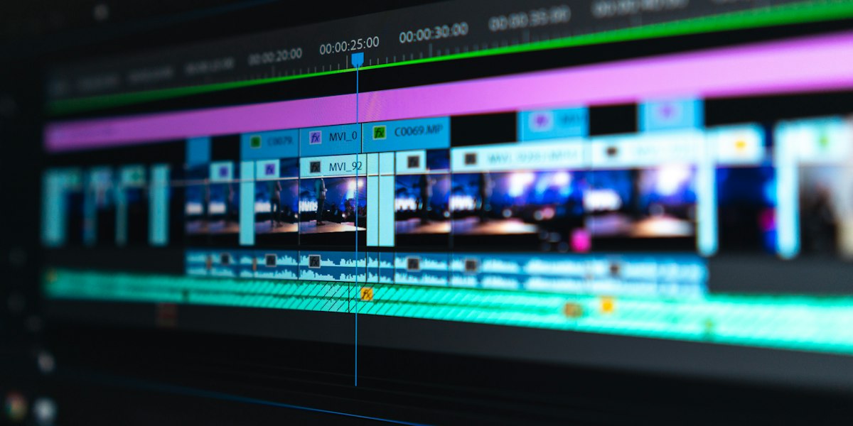
Cinematic colour grading is the post-production process that gives video a film look. It runs in three stages: technical correction of white balance, exposure and contrast; shot matching so every clip in a scene agrees; then a creative grade that sets the palette and mood, such as orange and teal or a film-emulation look.
Understanding Color Theory
Colour theory gives you a shared language for the choices you make in the grade. Before touching a control, decide what the viewer should feel and where their eye should go, then choose colours that support that decision.
The Color Wheel
Complementary colors (opposite on the wheel) create visual tension:
- Orange/Teal (the "blockbuster look")
- Red/Green
- Yellow/Purple
Complementary contrast is the simplest way to separate a subject from the background. Skin tones sit naturally in the warm orange range, so a slightly cooler background pushes faces forward without any extra lighting.
Color Temperature
- Warm tones (orange, yellow): Comfort, nostalgia, energy
- Cool tones (blue, teal): Mystery, professionalism, calm
Viewers read temperature emotionally before they notice it consciously. A warm grade tends to feel friendly and familiar, while a cool grade feels calmer, more clinical or more serious. Pick one direction for each scene and hold it, because temperature that drifts between shots reads as a mistake rather than a choice.
The Color Grading Workflow
A reliable grade follows the same order every time: correct, match, then create. Each stage depends on the one before it, so skipping ahead usually means redoing work later.

1. Technical Correction
First, fix technical issues:
- White balance adjustment
- Exposure correction
- Contrast balancing
- Noise reduction
Always correct before you grade. If the footage was shot in a log profile, convert it to a standard colour space such as Rec. 709 first, using a colour space transform or the camera maker's conversion LUT. Then set exposure and white balance on the waveform and vectorscope rather than by eye, because your eyes adapt to whatever they have been looking at.
2. Shot Matching
Ensure continuity between shots from the same scene:
- Match skin tones
- Consistent color temperature
- Similar contrast levels
Choose a hero shot for each scene, usually the most important angle, and match the other shots to it. Keep skin tones on the vectorscope's skin-tone line so faces stay consistent from cut to cut. Match contrast and exposure before colour, since a brightness difference often looks like a colour difference until it is fixed.
3. Creative Grade
Apply your artistic vision:
- Establish color palette
- Create mood through color
- Draw attention with selective color
- Add film emulation (grain, halation)
Build the look in separate, reversible adjustments rather than one heavy correction, so you can dial any part back later. Limit the palette to two or three dominant colours, which makes a frame feel designed rather than busy. Add grain and halation last, and lightly, because they sit on top of everything else and can quickly overpower the image.
Popular Cinematic Looks
Each established look suits some stories better than others. Treat these as starting points to adapt to your footage, not presets to apply unchanged.

Orange and Teal
The modern blockbuster aesthetic:
- Push shadows toward teal/cyan
- Push highlights toward orange
- Maintain balanced midtones
It suits action, travel and upbeat brand work where faces need to stand out against the scenery. The main risk is skin tones: push too far and faces turn orange or waxy, so isolate and protect skin before strengthening the look.
Bleach Bypass
High-contrast, desaturated look:
- Reduced saturation
- Increased contrast
- Milky blacks
- Popular for action and thriller genres
It suits gritty, tense or industrial subjects where a harder, colder feel helps the story. The main risk is lost shadow detail, so watch the bottom of the waveform and keep some texture in the darkest areas.
Film Emulation
Recreate the look of celluloid:
- Kodak Vision3 for warm, nostalgic feel
- Fuji for cooler, more neutral tones
- Add grain for organic texture
It suits nostalgic, documentary or premium brand work where a softer, more organic image helps. The main risk is overdoing it: heavy grain, strong halation or a faded black point starts to look like a filter rather than film, so compare against the corrected image as you work.
Tools of the Trade
Professional colorists use:
- DaVinci Resolve: Industry-standard color grading
- Color wheels: Primary correction tool
- Curves: Precise tonal control
- LUTs: Starting points or final looks
- Scopes: Waveform, vectorscope for technical accuracy
Treat a LUT as a starting point, not a finished grade, because it applies the same change to every shot regardless of how that shot was exposed. Scopes are the reference for every decision: the waveform shows brightness, the vectorscope shows hue and saturation, and both stay accurate when your eyes are tired.
Common Mistakes to Avoid
- Over-saturation: Keep it natural unless stylization is intentional. Strong saturation can clip bright reds and blues and tends to look cheap on phone screens.
- Inconsistent skin tones: Always protect skin tones. Viewers notice a shift in a face long before they notice a shift in the background.
- Crushing blacks: Maintain shadow detail. Clipped shadows cannot be recovered later and often break up into blocky noise once the film is compressed for the web.
- Ignoring scopes: Trust technical tools over your monitor. Your eyes adapt to the image in front of them, while the waveform and vectorscope do not.
- Working on uncalibrated displays: Color accuracy requires calibrated monitors. An uncalibrated screen can make a correct grade look wrong, so you end up fixing problems that are not in the footage.
Colour grading for corporate and brand video
Corporate and brand films are rarely watched in a cinema. They play on laptops, phones, social feeds and event screens, often in bright rooms, so the grade has to hold up on ordinary displays as well as a reference monitor. Keep brand colours consistent from shot to shot, and check that logos, products and branded sets still match the brand guidelines once the look is applied. Interviews need natural, healthy skin tones above everything else, because viewers partly judge a speaker by how they look on screen. Choose a restrained look that suits the brand rather than a heavy feature-film style that can date quickly or distract from the message. Deliver in the standard web colour space, Rec. 709, so the film looks the same across platforms. When a company commissions a series of films, save the look and use it as the shared starting point, so every film in the series feels like part of one family.
The Airframe Media Approach
We grade on calibrated HDR reference monitors in a controlled environment, ensuring your content looks stunning across all viewing platforms, from cinema screens to mobile devices.
Want your footage to have that cinematic look? Our post-production and colour grading team can grade your project for the screens it will play on.
Frequently Asked Questions
What is the difference between colour correction and colour grading?
Colour correction fixes technical problems so footage looks accurate: white balance, exposure, contrast and matching between shots. Colour grading comes after correction and is a creative choice. It sets the palette, contrast and mood of the finished film, such as a warm, nostalgic look or a cool, clinical one.
How do you get a cinematic look when colour grading?
Start from correctly exposed, balanced footage, then match every shot in a scene. Build the look with controlled contrast, a limited colour palette and protected skin tones, and use film emulation such as subtle grain or halation only where it suits the story. Check the result on scopes and a calibrated display.
What is the orange and teal look?
Orange and teal is a complementary colour grade that pushes shadows towards teal or cyan and highlights towards orange while keeping midtones balanced. Skin tones sit in the warm range, so faces separate from cooler backgrounds. Used heavily it can look dated, so many grades apply it subtly.
Do you need a LUT to colour grade video?
No. A LUT is a fixed colour transform, useful for converting log footage to a standard colour space or as a starting point for a look. It cannot adapt to each shot, so a proper grade still adjusts exposure, balance and contrast shot by shot before or after the LUT is applied.
ABOUT THE AUTHOR
Founder & CEO
Liam founded Airframe Media in 2015 and leads creative direction across the studio. His work spans corporate, commercial, and event films for UK businesses including Levy, Taylor Wimpey, and ExCeL London, and he writes about professional video production in London.
TAGS
Related Services
Ready to Bring Your Vision to Life?
Let's discuss how our video production services can elevate your brand